
Results
Please note that for the data presented below, the numbers come from tables provided by Statistics Canada; there is no analysis of the relationship between variables – dependent or independent. Thus, it is not possible to construct profiles of payers or recipients, nor to indicate which dependent variables (e.g., demographics) have the most effect on the independent variables (e.g., payments, arrears). The data are presented predominantly to display the proof of concept for the pilot study. Data analysis will be possible with any future data linkage project.
Demographic information of all payers and recipients: sex, immigration status, visible minority, Indigeneity, and knowledge of official language
For the combined sample of payers and recipients the follow demographics were identified:
- 96% of payors in the sample were male, and 96% of recipients were female
- 88% of payors and 89% of recipients did not identify as a visible minority or as Indigenous
- 8% of payors and recipients identified as Indigenous
- 2% of payors and recipients were immigrants to Canada
- 95% of payors and 93% of recipients spoke English at home
Demographic information for payers and recipients enrolled or not enrolled in a MEP
The demographic information for individuals enrolled in a MEP and not enrolled in a MEP are presented below. Because the information for Indigenous and racial identity of individuals not enrolled in a MEP was not available, information for the general population for the three participating provinces is presented.
Payers and recipients enrolled in a MEP had a higher employment rate than those not enrolled in a MEP.
For this study, individuals who have employment income (EI) and /or self-employment income (SEI), and the combined income of EI and SEI greater than $1,000, are deemed to be employed. Over ten years, on average, 90% of payers and 77% of recipients enrolled in a MEP were employed compared with 82% of payers and 66% of recipients not enrolled in a MEP were employed (Table 4).
More recipients than payers were single.
More recipients enrolled in a MEP were single (41%) compared with payers enrolled in a MEP (37%). Comparatively, more recipients not enrolled in a MEP were single (21%) than payers not enrolled in a MEP (13%) (Table 4).
Payers enrolled in a MEP were older than recipients enrolled in a MEP, and individuals not enrolled in a MEP were older than those enrolled in a MEP.
Payers enrolled in a MEP were older than recipients enrolled in a MEP. For example, 42% of payers enrolled in a MEP were between the ages of 41 and 50 years, while 42% of recipients enrolled in a MEP were between 31 and 40 years old. Individuals not enrolled in a MEP were older than those enrolled in a MEP. Twenty two percent of payers not enrolled in a MEP were over 61 years old compared with two percent of those enrolled in a MEP. Similarly, 16% of recipients not enrolled in a MEP and 1% of recipients enrolled in a MEP were over 61 years old (Table 4).
| Demographic characteristics | Payers enrolled in a MEP | Payers not enrolled in a MEP | Recipients enrolled in a MEP | Recipients not enrolled in a MEP | |
|---|---|---|---|---|---|
| Employment status |
Employed | 90% | 82% | 77% | 66% |
| Unemployed | 10% | 18% | 23% | 34% | |
| Marital status | Married/common-law | 38% | 52% | 27% | 37% |
| Separated/Divorced/Widowed | 25% | 34% | 32% | 42% | |
| Single | 37% | 13% | 41% | 21% | |
| Age group | 15-30 | 8% | 6% | 14% | 11% |
| 31-40 | 35% | 16% | 42% | 22% | |
| 41-50 | 42% | 30% | 35% | 30% | |
| 51-60 | 13% | 27% | 7% | 21% | |
| over 61 | 2% | 22% | 1% | 16% | |
| Racial and Indigenous Identity* |
Visible Minority | 4% | N/A | 2% | N/A |
| Non-visible minority | 88% | N/A | 89% | N/A | |
| Indigenous | 8% | N/A | 8% | N/A |
Data source: T1FF data (2006 to 2015), Census 2016, and SMEP for the provinces of Nova Scotia (2005/2006 to 2015/2016), Prince Edward Island (2007/2008 to 2015/2016), and Newfoundland and Labrador (2010/2011 to 2015/2016).
A small percentage of payers and recipients self-identified as a visible minority or Indigenous.
According to the data, in 2016, 4% of payers enrolled in a MEP and 2% of recipients enrolled in a MEP self-identified as a visible minority. Eight percent each of payers and recipients enrolled in a MEP self-identified as Indigenous (Table 4). In comparison, for the three participating provinces, in the general population, 4.9% of individuals were self-identified a visible minority and 6.4% of them were self-identified as Indigenous in 2016.Footnote 13
In general, retired payers and recipients not enrolled in a MEP had higher incomes than those enrolled in a MEP.
Overall retired payers had higher incomes then retired recipients. Retired payers and recipients not enrolled in a MEP had higher income than those enrolled in a MEP (Figure 1). For instance, over ten years, on average, the median income of payers and recipients enrolled in a MEP were $24,700 and $18,600, respectively. In comparison, the median income of payers and recipients who were not enrolled in a MEP were $42,200 and $21,000, correspondingly.

Figure 1 - Graph Description
A horizontal line graph with four rows. The x-axis indicates dollar values from 0 to 50,000 in increments of 10,000. The y-axis indicates from top to bottom, recipients not with MEP, recipients with MEP, payers not with MEP, payers with MEP with a row beside each. The row beside Recipients not with MEP reaches $21,000, followed by $18,600 for Recipients with MEP, $42,000 for Payers not with MEP, and $24,700 for Payers with MEP.
Data source: Census 2016, T1FF data (2006 to 2015), and SMEP for the provinces of Nova Scotia (2005/2006 to 2015/2016), Prince Edward Island (2007/2008 to 2015/2016), and Newfoundland and Labrador (2015/2016).A very small percentage of payers and recipients enrolled in a MEP were retired.
An individual is retired if they are over 55 years of age and receive more than 50% of their total income through retirement income. Retirement income includes the sum of Old Age Security Payments, benefits from the Canada Pension Plan (CPP) and Quebec Pension Plan (QPP), Net Federal Supplements (including the Guaranteed Income Supplement, and Registered Retired Savings Plan (RRSP) income).
Over 10 years and on average, one percent of payers and recipients enrolled in a MEP were retired compared with 16% of payers and 11% of recipients not enrolled in a MEP.
Payers and recipients were employed by various industries.
Payers enrolled in a MEP were more likely to be employed in the construction industry (18%), followed by manufacturing (14%) and public administration (11%). In comparison, recipients enrolled in a MEP were more likely to be employed in the health care and social assistance sector (19%), followed by retail trade (14%) and public administration (14%).
Payers not enrolled in a MEP were more likely to be employed in public administration (21%), while recipients not enrolled in a MEP were more likely to be employed in education, or health care and social assistance sector (27%).
More recipients than payers enrolled in a MEP lived in subsidized housing.
According to the Statistics Canada, subsidized housing includes rent geared to income, social housing, public housing, government-assisted housing, non-profit housing, rent supplements and housing allowances. According to the data, in 2016, 3% of payers enrolled in a MEP lived in subsidized housing, while 10% of recipients enrolled in a MEP were in the same situation.Footnote 14
More payers than recipients enrolled in a MEP owned their home.
Owning a home can have a big impact on an individual’s net worth. According to the Survey of Financial Security, the net worth of homeowners increased 112% from $323,700 in 1999 to $685,400 in 2019. In comparison, the net worth of renters increased 64% from $14,600 to $24,000 over the same period.Footnote 15 Home ownership in the Census refers to whether an individual owns their home, rents, or if their dwelling is part of band housing (a house on reserve or settlement). 2016 Census data show that home ownership was higher among payers enrolled in a MEP (64%) than recipients enrolled in a MEP (56%). There were more recipients renting their home (43%) than payers (35%).
Income
Payers who were not enrolled in a MEP had higher income than payers who were enrolled with a MEP.
Payers who were not enrolled in a MEP earned more than payers who were enrolled in MEP (Figure 2). For instance, over ten years (2006 to 2016), on average, the median gross incomeFootnote 16 of payers not enrolled in a MEP ($59,100) was 1.5 times that of payers who were enrolled in a MEP ($38,400). On the contrary, the median gross income for recipients who were enrolled in a MEP was higher than the median gross income of recipients who were not enrolled in a MEP ($29,200 vs. $27,600).Footnote 17
Figure 2 shows recipients enrolled in a MEP had lower gross income than payers enrolled in a MEP. This suggests that recipients enrolled in a MEP have a greater need for enforcement of their support orders by MEPs to ensure they get the support on time and in full amounts.

Figure 2 - Graph Description
A horizontal line graph with four rows. The x-axis indicates dollar values from 0 to 70,000 in increments of 10,000. The y-axis indicates from top to bottom, recipients not with MEP, recipients with MEP, payers not with MEP, payers with MEP with a row beside each. The row beside Recipients not with MEP reaches $27,600, followed by $29,200 for Recipients with MEP, $59,100 for Payers not with MEP, and $38,400 for Payers with MEP.
Data source: T1FF data (2006 to 2015), and SMEP for the provinces of Nova Scotia (2005/2006 to 2015/2016), Prince Edward Island (2007/2008 to 2015/2016), and Newfoundland and Labrador (2010/2011 to 2015/2016).More payers and recipients who were enrolled in a MEP were low-income than those who were not enrolled.
Low-income status is assigned when an individual’s income falls below 50% of the median adjusted total household income as identified by Statistics Canada through the low-income measure (LIM).Footnote 18
The data shows that from 2006 to 2016 more payers and recipients enrolled with a MEP were identified as low-income than those who were not enrolled with a MEP (Figure 3).Footnote 19 On average, over ten years, about twice as many payers enrolled in a MEP (12%) were low-income as payers compared with those not enrolled in a MEP (5%). Similarly, 30% of recipients enrolled in a MEP were low-income, while 24% of recipients not enrolled in a MEP were low-income.
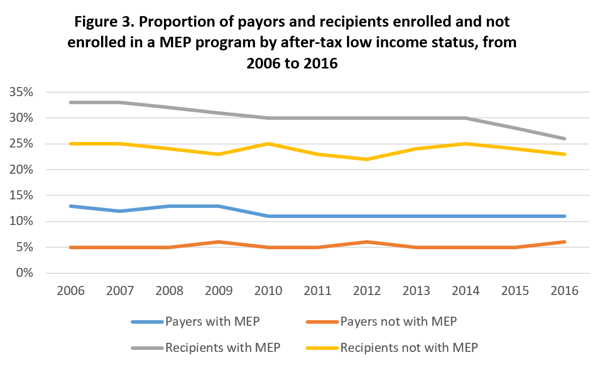
Figure 3 - Graph Description
There is a line graph with four horizontal lines. The x-axis lists years from 2006 to 2016. The y-axis indicates percentages from 0 to 35, increasing in increments of 5.
Below the figure is a legend indicating a blue line as “Payers with MEP”, an orange line as “Payers not with MEP”, a grey line as “Recipients with MEP”, and a yellow line as “Recipients not with MEP”.
At the top of the graph, the grey line identified as “Recipients with MEP” starts and remains at 33% in 2006 and 2007, drops to 32% in 2008, drops to 31% in 2009, drops and remains at 30% in 2010 until 2014, drops to 28% in 2015, and drops to 26% in 2016.
Below the grey line is the yellow line identified as “Recipients not with MEP” that starts and remains at 25% in 2006 and 2007, drops to 24% in 2008, drops to 23% in 2009 before rising to 25% in 2010. It then drops to 23% in 2011, drops to 22% in 2012, rises to 24% in 2013, rises to 25% in 2014, drops to 24% in 2015 and drops again to 23% in 2016.
Below the yellow line is the blue line identified as “Payers with MEP” that starts at 13% in 2006. The line then drops to 12% in 2007, rises and stays at 13% in 2008 and 2009, before dropping and remaining at 11% from 2010 to 2016.
Below the blue line is the orange line identified as “Payers not with MEP” that starts and remains at 5% in 2006 to 2008. It then rises to 6% in 2009, drops and remains at 5% in 2010 and 2011, rises to 6% in 2012, drops and remains at 5% in 2013 to 2015, before rising to 6% in 2016.
Data source: T1FF data (2006 to 2015), and SMEP for the provinces of Nova Scotia (2005/2006 to 2015/2016), Prince Edward Island (2007/2008 to 2015/2016), and Newfoundland and Labrador (2010/2011 to 2015/2016).The majority of payers and recipients contributed and received child support payments that were less than 25% of their gross income.Footnote 20
The data shows over 10 years, on average, that 94% of payers and 92% of recipients enrolled in a MEP contributed and received maintenance payments that were less than 25% of their gross income, respectively. Four percent of payers and 6% of recipients enrolled in a MEP paid and received maintenance payments that were between 25% and 50% of their gross income. Furthermore, 2% of payers and 2% of recipients enrolled in a MEP contributed and received maintenance payments that were more than 50% of their gross income.
Over ten years, on average, 95% of payers and 86% of recipients not enrolled in a MEP paid and received maintenance payments that were less than 25% of their income. In addition, 5% of payers and 14% of recipients not enrolled in a MEP paid and received maintenance payments that were more than 25% of their income.
Income support
More payers and recipients who were enrolled in a MEP received government transfers than those who were not enrolled.
Government transfers cover a range of programs. They include Employment Insurance benefits, Canada Pension Plan, and Quebec Pension Plan (including disability and death pensions), Old Age Security, Net Federal Supplement, Child Tax Benefit, Social Assistance payments, Workers’ Compensation benefits, the Goods and Services Tax (GST)/Harmonized Sales Tax (HST) Credit and provincial/territorial refundable tax credits, Family Benefits,Footnote 21 and Working Income Tax Benefit are included as government transfers in this study.
The data show that from 2006 to 2016 there were more payers and recipients enrolled in a MEP who received government transfers than those not enrolled in a MEP (Figure 4). In addition, more recipients than payers received government transfers than payers, regardless of whether they were enrolled in a MEP or not. Over the ten years, on average, 62% of payers and 93% of recipients enrolled in a MEP received government transfers. In comparison, 49% of payers and 82% of recipients not enrolled in a MEP received government transfers.

Figure 4 - Graph Description
There is a line graph with four horizontal lines. The x-axis lists years from 2006 to 2016. The y-axis indicates percentages from 0 to 100, increasing in increments of 20.
Below the figure is a legend indicating a blue line as "Payers with MEP”, an orange line as “Payers not with MEP”, a grey line as “Recipients with MEP”, and a yellow line as “Recipients not with MEP”.
At the top of the graph, the grey line identified as “Recipients with MEP” starts and remains at 94% in 2006 and 2007, drops to and remains at 93% in 2008 until 2011, drops to and remains at 92% in 2012 until 2014, drops to 91% in 2015 before rising to 92% in 2016.
Below the grey line is the yellow line identified as “Recipients not with MEP” that starts and remains at 82% in 2006 until 2008, drops to 81% in 2009 and 2010, rises to 82% in 2011 before dropping to 81% in 2012 until 2014. It then rises to 82% in 2015 and rises to 83% in 2016.
Below the yellow line is the blue line identified as “Payers with MEP” that starts at 64% in 2006. The line then drops to and stays at 60% in 2007 and 2008, rises to 62% in 2009, rises to 64% in 2010 before dropping to 63% in 2011. The line drops to 61% in 2012, drops to 60% in 2013, rises to 62% in 2014, rises to 64% in 2015, and rises again to 65% in 2016.
Below the blue line is the orange line identified as “Payers not with MEP” that starts at 46% in 2006. It then drops to 44% in 2007, rises to 47% in 2008, rises to 48% in 2009, rises to 49% in 2010, then drops to 48% in 2011. The line rises to and remains at 49% in 2012 and 2013, rises to 51% in 2014, rises to 55% in 2015, before rising to 58% in 2016.
Data source: T1FF data (2006 to 2015), and SMEP for the provinces of Nova Scotia (2005/2006 to 2015/2016), Prince Edward Island (2007/2008 to 2015/2016), and Newfoundland and Labrador (2010/2011 to 2015/2016).This may be due to the fact that individuals enrolled in a MEP were lower income, on average, and therefore more likely to qualify for government transfers than those not enrolled in a MEP.
More payers and recipients who were enrolled in a MEP received social assistance than those who were not enrolled.
Social assistance payments are received based on need. Eligible social assistance recipients may receive assistance to cover the cost of food, shelter, clothing, and other daily necessities. Figure 5 shows that there were more payers and recipients who were enrolled in a MEP who received social assistanceFootnote 22 in the reference period than those who were not enrolled. Moreover, more recipients than payers received social assistance. Data shows that over ten years, on average, 5% of payers and 17% of recipients enrolled in a MEP received social assistance payments, while only 1% of payers and 8% of recipients not enrolled in a MEP received social assistance payments. This may also be because individuals enrolled in a MEP were lower income, on average, and therefore more likely to qualify for social assistance than those not enrolled in a MEP.

Figure 5 - Graph Description
There is a line graph with four horizontal lines. The x-axis lists years from 2006 to 2016. The y-axis indicates percentages from 0 to 20%, increasing in increments of 5.
Below the figure is a legend indicating a blue line as “Payers with MEP”, an orange line as “Payers not with MEP”, a grey line as “Recipients with MEP”, and a yellow line as “Recipients not with MEP”.
At the top of the graph, the grey line identified as “Recipients with MEP” starts at 18% in 2006, drops to 17% in 2007, drops and remains at 15% in 2008 and 2009, before rising to an remaining at 19% in 2010 and 2011. The line drops to 18% in 2012, drops to and remains at 17% in 2013 and 2014, drops to 16% in 2015, and drops to 15% in 2016.
Below the grey line is the yellow line identified as “Recipients not with MEP” that starts at 11% in 2006, drops to 10% in 2007, drops to 9% in 2008, drops to 8% in 2009, before rising to 9% in 2010. The line drops to 8% in 2011, drops to 7% in 2012, rises to and stays at 8% in 2013 until 2015, and drops to 7% in 2016.
Below the yellow line is the blue line identified as “Payers with MEP” that starts at 5% in 2006. The line then drops to and stays at 4% in 2007 and 2008, rises to and stays at 5% in 2009 until 2011, before dropping to 4% in 2012. The line rises to and stays at 5% in 2013 until 2015, and drops again to 4% in 2016.
Below the blue line is the orange line identified as “Payers not with MEP” that starts at and remains at 1% in 2006 until 2012, rises to 2% in 2013, and drops again and remains at 1% in 2014 until 2016.
Data source: T1FF data (2006 to 2015), and SMEP for the provinces of Nova Scotia (2005/2006 to 2015/2016), Prince Edward Island (2007/2008 to 2015/2016), and Newfoundland and Labrador (2010/2011 to 2015/2016).More payers and recipients who were enrolled in a MEP received employment insurance than those who were not enrolled.
More payers and recipients enrolled in a MEP received employment insurance (EI) payments than their counterparts not enrolled in a MEP. Over 10 years, on average, about twice as many payers enrolled in a MEP (33%) received EI payments as payers not enrolled in a MEP (16%). Twenty five percent of recipients enrolled in a MEP received EI, while seventeen percent of recipients not enrolled in a MEP received EI.
The majority of recipients received the Canada Child Benefit (CCB) compared with a small percentage of payers.
The CCB is a tax-free monthly payment provided to qualified families to assist with the expenses associated with raising children under 18 years old. If a couple was separated or divorced, only one parent can receive the CCB. Over ten years, on average, 84% of recipients enrolled in a MEP received the CCB compared with 6% of payers enrolled in a MEP. Forty-five percent of recipients not enrolled in a MEP and four percent of payers not enrolled in a MEP received the CCB.
There were more payers and recipients enrolled in a MEP who received the Government Goods and Sales Tax (GST) Credit compared with those not enrolled in a MEP.
The GST Credit functions as an income-tested tax credit, mitigating the regressive nature of the tax by returning a portion or all of the GST paid by low-and-modest-income Canadians when they purchase taxable goods and services. Over ten years, on average, 37% of payers enrolled in a MEP received GST Credits compared with 20% of payers not enrolled in a MEP. Sixty-one percent of recipients enrolled in a MEP received GST Credits compared with 49% of recipients not enrolled in a MEP. Data shows (Figure 6) that recipients were more likely to receive GST Credits than payers, regardless of whether they were enrolled in a MEP or not.

Figure 6 - Graph Description
There is a line graph with four horizontal lines. The x-axis lists years from 2006 to 2016. The y-axis indicates percentages from 0 to 70%, increasing in increments of 10.
Below the figure is a legend indicating a blue line as “Payers with MEP”, an orange line as “Payers not with MEP”, a grey line as “Recipients with MEP”, and a yellow line as “Recipients not with MEP”.
At the top of the graph, the grey line identified as “Recipients with MEP” starts at 66% in 2006, drops to 62% in 2007, drops to and remains at 61% in 2008 and 2009, drops to and remains at 60% in 2010 until 2015, before dropping to 59% in 2016.
Below the grey line is the yellow line identified as “Recipients not with MEP” that starts at 50% in 2006, drops to 46% in 2007, rises to 47% in 2008, drops to 46% in 2009, before rising to 47% in 2010. The line rises to and remains at 48% in 2011 and 2012, rises to 49% in 2013, rises to 51% in 2014, rises to 53% in 2015, before dropping to 52% in 2016.
Below the yellow line is the blue line identified as “Payers with MEP” that starts at 41% in 2006. The line then drops to 37% in 2007, drops to 36% in 2008, rises to 38% in 2009, before dropping to 36% in 2011. The line drops to and remains at 34% in 2012 and 2013, rises to 37% in 2014, before rising to and remaining at 38% in 2015 and 2016.
Below the blue line is the orange line identified as “Payers not with MEP” that starts at 23% in 2006, drops to 21% in 2007, before dropping to and remaining at 20% in 2008 and 2009. The line drops to and remains at 18% in 2010 until 2012, drops to 17% in 2013, rises to 19% in 2014, rises to 20% in 2015, before rising to 22% in 2016.
Data source: T1FF data (2006 to 2015), and SMEP for the provinces of Nova Scotia (2005/2006 to 2015/2016), Prince Edward Island (2007/2008 to 2015/2016), and Newfoundland and Labrador (2010/2011 to 2015/2016).Payers and recipients not enrolled in a MEP received similar amounts of Children’s Fitness Tax Credit as payers and recipients enrolled in a MEP.
The Children’s Fitness Tax Credit allows taxpayers to claim eligible fees paid in the year up to a maximum of $500 per child. Eligible fees incorporate an amount paid related to the cost of registration or membership for your or your spouse's or common-law partner's child in a prescribed program of physical activity. To qualify, the child must have been under 16 years of age (or under 18 years of age if eligible for the disability tax credit) at the beginning of the year in which an eligible fitness expense was incurred. For this study, the amounts reported for the Children’s Fitness Tax Credit are based on the T1FF variable Children’s Fitness Amount (CFA). The CFA was only reported for the years 2007 to 2014, inclusively. It was replaced by the Children’s Fitness and Arts Tax Credits in 2015. Over eight years (2007 to 2014), on average, 6% of payers enrolled in a MEP claimed the CFA compared with 11% of payers not enrolled in a MEP. Sixteen percent of recipients enrolled in a MEP and eleven percent of recipients not enrolled in a MEP claimed the CFA. Payers and recipients not enrolled in a MEP received a similar amount of Children’s Fitness Credits as payers and recipients enrolled in a MEP. For instance, over the eight years (2007 to 2014), on average, payers and recipients in a MEP both received $470. In comparison, payers and recipients not enrolled received $520 and $510 of the CFA, respectively.
More recipients than payers claimed childcare expenses.
Over the 10 years, on average, more recipients than payers claimed childcare expenses,Footnote 23 regardless of whether they were enrolled in a MEP or not. For instance, 17% of recipients enrolled in a MEP and 11% of recipients not enrolled in a MEP claimed childcare expenses. In comparison, 4% of payers enrolled in a MEP and 3% of payers not enrolled in a MEP claimed childcare expenses. The average childcare expenses that payers and recipients enrolled in a MEP claimed were $3,200 and $2,900 per year, respectively. In comparison, the average amount of childcare expenses that payers and recipients not enrolled in a MEP claimed were the same: $3,100 per year.
Child support paid
The median annual amount of child support paid and received varied yearly.
For this study, child support paid is based on the total payment due.Footnote 24 Over the ten years, the median annual amount paid by payers enrolled in a MEP varied. The highest and lowest median amounts paid were $3,500 (2015) and, $990 (2016), respectively. The median amount of child support paid over the ten years was $2,700. In comparison, the median amount of child support received by the recipients enrolled in a MEP was $2,300 over the ten years. The highest and lowest median of child support amount received by the recipients were $2,900 (2015) and $900 (2016), correspondently (Figure 7).Footnote 25

Figure 7 - Graph Description
A vertical bar graph with 11 pairs of columns. The x-axis indicates the years 2006 to 2016. The y-axis indicates dollar values from 0 to 4,000 in increments of 500.
The legend below the graph notes that blue is for “Payers with MEP” and orange is for “Recipients with MEP”.
The pair above 2006 has the blue column going up to $2,400 and the orange column going up to $2,000.
The pair above 2007 has the blue column going up to $2,400 and the orange column going up to $2,100.
The pair above 2008 has the blue column going up to $2,500 and the orange column going up to $2,200.
The pair above 2009 has the blue column going up to $2,700 and the orange column going up to $2,300.
The pair above 2010 has the blue column going up to $2,600 and the orange column going up to $2,300.
The pair above 2011 has the blue column going up to $3,000 and the orange column going up to $2,500.
The pair above 2012 has the blue column going up to $3,000 and the orange column going up to $2,600.
The pair above 2013 has the blue column going up to $3,300 and the orange column going up to $2,700.
The pair above 2014 has the blue column going up to $3,400 and the orange column going up to $2,700.
The pair above 2015 has the blue column going up to $3,500 and the orange column going up to $2,900.
The pair above 2016 has the blue column going up to $990 and the orange column going up to $900.
Data source: T1FF data (2006 to 2015), and SMEP for the provinces of Nova Scotia (2005/2006 to 2015/2016), Prince Edward Island (2007/2008 to 2015/2016), and Newfoundland and Labrador (2010/2011 to 2015/2016).Compliance and Arrears
The degree of compliance with child support varied by the length of time a case was registered.
Regular monthly payments refer to the amounts ordered by a court, or upon agreement between payers and recipients, to be paid on every month on an ongoing basis. For SMEP, compliance means that the monthly support payment is received in full or in part by the beneficiary. Full compliance means that the payment due in a month is made in full. Partial compliance is defined as some of the amount due in a month are paid, while non-compliance means no support amounts are paid.
Figure 8 shows that 33% of payers enrolled in a MEP for less than or equal to one year were in full compliance with regular monthly payments while 44% of payers enrolled in a MEP for greater than ten years were in full compliance. Non-compliant status varied with the payer’s length of enrolment in a MEP. For instance, data show that 21% of payers enrolled in a MEP for less than a year did not pay their support, while only 12% of payers who were enrolled in a MEP for more than ten years failed to make any support payments.

Figure 8 - Graph Description
A vertical bar graph with 12 columns in total, divided into four groups of three. The x-axis indicates Less than or equal to 1 year, Greater than 1 year to 5 years, Greater than 5 years to 10 years, and Greater than 10 years. The y-axis indicates percentages from 0% to 60% in increments of 10.
The legend below the graph notes that blue is for “Fully compliant”, orange is for “Partially compliant”, and grey is for “Non-compliant”.
The group above “Less than or equal to 1 year” has the blue column going up to 33%, the orange column going up to 46%, and the grey column going up to 21%.
The group above “Greater than 1 year to 5 years” has the blue column going up to 36%, the orange column going up to 55%, and the grey column going up to 8%.
The group above “Greater than 5 years to 10 years” has the blue column going up to 41%, the orange column going up to 48%, and the grey column going up to 10%.
The group above “Greater than 10 years” has the blue column going up to 44%, the orange column going up to 44%, and the grey column going up to 12%.
Data source: T1FF data (2006 to 2015), and SMEP for the provinces of Nova Scotia (2005/2006 to 2015/2016), Prince Edward Island (2007/2008 to 2015/2016), and Newfoundland and Labrador (2010/2011 to 2015/2016).Total monthly payments include the regular monthly payment plus scheduled arrears, event-driven payments, fees, costs, and penalties due. Thirty one percent of payers who were enrolled in a MEP less than or equal to one year were in full compliance with total monthly payments as compared with 42% of payers who were enrolled in a MEP for greater than ten years. The highest partial compliance rate (57%) with total monthly payments was for those payers enrolled in a MEP between one and five years, and the lowest partial compliance rate (46%) was when payers were enrolled in a MEP for more than ten years (Figure 9).

Figure 9 - Graph Description
A vertical bar graph with 12 columns in total, divided into four groups of three. The x-axis indicates Less than or equal to 1 year, Greater than 1 year to 5 years, Greater than 5 years to 10 years, and Greater than 10 years. The y-axis indicates percentages from 0% to 60% in increments of 10.
The legend below the graph notes that blue is for “Fully compliant”, orange is for “Partially compliant”, and grey is for “Non-compliant”.
The group above “Less than or equal to 1 year” has the blue column going up to 31%, the orange column going up to 48%, and the grey column going up to 21%.
The group above “Greater than 1 year to 5 years” has the blue column going up to 35%, the orange column going up to 57%, and the grey column going up to 8%.
The group above “Greater than 5 years to 10 years” has the blue column going up to 40%, the orange column going up to 50%, and the grey column going up to 10%.
The group above “Greater than 10 years” has the blue column going up to 42%, the orange column going up to 46%, and the grey column going up to 12%.
Data source: T1FF data (2006 to 2015), and SMEP for the provinces of Nova Scotia (2005/2006 to 2015/2016), Prince Edward Island (2007/2008 to 2015/2016), and Newfoundland and Labrador (2010/2011 to 2015/2016).Once individuals are enrolled in a MEP, MEPs provide administrative support (e.g., wage garnishment, motor vehicle license suspension, and passport denials) to payers and recipients of child and spousal support to ensure recipients receive their support payments.
More than half of payers and recipients enrolled in a MEP had arrears owing or were owed arrears.
When a person who is obliged to pay support fails to pay all the support they are required to pay, the debt owing is called arrears.
Over the 10 years, on average, 53% of payers had arrears owing,Footnote 26 and 58% of recipients had arrears owed to them. The median amount of arrears of payers enrolled in a MEP was $1,400. The median amount of arrears owing to recipients enrolled in a MEP was $1,900.
The proportion of payers enrolled in a MEP who had arrears was lower than the proportion of arrears owed to recipients enrolled in a MEP. This could be because there was not necessarily a 1:1 relationship between payers and recipients (see Limitations section):
Generally, the proportion of retired recipients enrolled in a MEP were more likely to have arrears than retired payers enrolled in a MEP. For example, over the ten years, on average, 56% of retired recipients enrolled in a MEP had arrears compared with 44% of retired payers not enrolled in a MEP.
Most payers and recipients enrolled in a MEP, and who were on social assistance, had arrears owing or were owed arrears.Footnote 27
The majority of payers and recipients enrolled in a MEP and who were on social assistance had arrears owing or were owed arrears. Over the ten years, on average, 88% of payers enrolled in a MEP who were on social assistance had arrears owing. The median of arrears owed by these payers was $3,300. This implied that payers enrolled in a MEP and were on social assistance had a difficult time paying support.
Ninety percent of recipients enrolled in a MEP who were on social assistance had arrears owed to them. The median amount owed to the recipients was $4,500.
- Date modified: